Status Frame
The Status Frame provides a customizable interface for creating toggle buttons with icons. Aurora comes with a global status frame that includes common toggles like Rotation, Cooldown, and Interrupt controls.
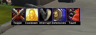
Using the Global Status Frame
The global status frame is automatically initialized and provides a set of default toggles. You can access these default toggles through Aurora.Rotation:
-- Default global toggles
Aurora.Rotation.Toggle    -- Main rotation toggle
Aurora.Rotation.Cooldown  -- Cooldown usage toggle
Aurora.Rotation.Interrupt -- Interrupt toggle
Adding Custom Toggles
You can add your own toggles to the global status frame using Aurora:AddGlobalToggle():
local myToggle = Aurora:AddGlobalToggle({
    label = "AoE:",              -- Display name (max 11 characters)
    var = "my_aoe_toggle",       -- Unique identifier for saving state
    icon = "Interface/Icons/Spell_Holy_HolyNova", -- Icon texture or spell ID
    tooltip = "Toggle AoE mode", -- Tooltip text
    onClick = function(value)    -- Optional callback when clicked
        print("AoE mode:", value)
    end
})

-- Later you can check the toggle state
if myToggle:GetValue() then
    -- AoE mode is enabled
end
Toggle Options
| Option | Type | Description |
|---|---|---|
label | string | Display text (max 11 chars) |
var | string | Unique identifier for saving state |
icon | string/number | Icon texture path or spell ID |
tooltip | string | Hover tooltip text |
onClick | function | Callback function when clicked |
Icon Sources
Icons can be specified in two ways:
-
Texture Path: Direct path to the icon texture
icon = "Interface/Icons/Spell_Nature_Lightning" -
Spell ID: Numeric spell ID that will use that spell's icon
icon = 48108 -- Will use Pyroblast's icon
Controlling Toggles
Toggles provide methods to control their state:
-- Get current value
local isEnabled = myToggle:GetValue()

-- Set value programmatically
myToggle:SetValue(true)

-- Update tooltip text
myToggle:SetCustomText("New tooltip text")
State Persistence
Toggle states are automatically saved between sessions. The saved state is restored when the toggle is recreated with the same var name.
Overriding Toggle Icons
You can change the icon of an existing toggle using Aurora:OverrideIcon():
-- Override the icon of an existing toggle by its var name
Aurora:OverrideIcon("my_aoe_toggle", "Interface/Icons/Spell_Fire_FlameBolt")
-- Or use a spell ID
Aurora:OverrideIcon("my_aoe_toggle", 48108)  -- Pyroblast icon
The function accepts both texture paths and spell IDs, automatically resolving spell IDs to their corresponding icon textures. Returns true if the toggle was found and updated, false otherwise.
Removing Toggles
You can remove an existing toggle from the global status frame using Aurora:RemoveGlobalToggle():
-- Remove a toggle by its var name
local removed = Aurora:RemoveGlobalToggle("my_aoe_toggle")
if removed then
    print("Toggle removed successfully")
else
    print("Toggle not found")
end
Returns true if the toggle was found and removed, false otherwise.
Example: Class-Specific Toggles
Here's an example of adding class-specific toggles to a rotation:
    Aurora.Rotation.BurstToggle = Aurora:AddGlobalToggle({
        label = "Burst",
        var = "my_burst_toggle",
        icon = "Interface/Icons/Ability_Warrior_BattleShout",
        tooltip = "Enable burst mode rotation"
    })
    Aurora.Rotation.DefensiveToggle = Aurora:AddGlobalToggle({
        label = "Defensive",
        var = "my_defensive_toggle",
        icon = "Interface/Icons/Ability_Warrior_DefensiveStance",
        tooltip = "Use defensive cooldowns"
    })
end

if Aurora.Rotation.DefensiveToggle:GetValue() then
    -- Do Defensives
end
Keep toggle labels short and descriptive. The maximum length is 11 characters, and shorter labels often look better.
All toggles are saved automatically and will remember their state between game sessions.